Product Design: Verblio Kickstart
Project Overview
Project Summary & Areas of Opportunity
When in-house at Verblio, a content creation platform based in Denver, CO, I was tasked with designing & piloting a suite of products called “Kickstart.” Verblio nurtures a network of over 3,000 writers—plus a marketplace business model and an easy-to-use platform. Customers include in-house marketers, digital agencies, and online publishers.
Essentially “Kickstart” was, and is (still a product line, still profitable for Verblio), a choose-your-own onboarding which aimed to accomplish two primary goals:
Improve retention and onboarding experience for Verblio customers, and
Further monetize new customers and get them primed for success in the platform
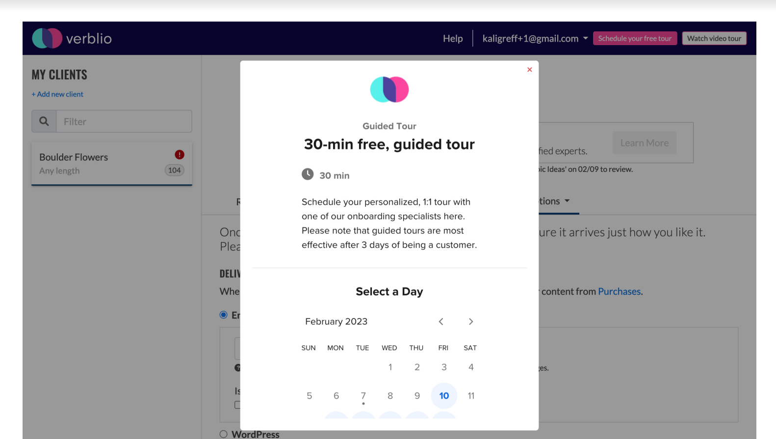
These one-off offerings ranged from the free post-sale demo or “guided tour” to our first-ever offerings ever of content/SEO strategy as a higher-end consulting package. It also includes a “jumpstart” with 10 topics generated by Verblio to get the customer/writers started, as well as a personalized setup of the account.
Customer problems to be solved and their respective products:
Not understanding how to use our platform effectively (Guided Tour)
Feeling lost and stuck with regard to coming up with topics to start (10 Topics)
Not having time or resources to set up Verblio to its most powerful right away (Expert Account Setup)
No SEO basics, keyword research; no idea how to approach content strategy (Content Strategy, Planning & Setup)
The Process
How I Helped
Completed informal customer interviews to scope & determine which products would be of highest value to them
Worked cross-departmentally in sprints with the developers, product manager, business development team, CEO, marketing team, and operations to design, make decisions, and execute the product with constraints of onboarding flow in mind
Communicated key phases, steps, and KPIs to stakeholders and the broader team at weekly AllHands meetings; essentially served as “product owner”
Selected calendar solution to use for scheduling features of guided tour, content strategy sessions—at outset, it was HubSpot to align with our CRM, but afterward we changed to integrate Calendly instead to incorporate round-robin features for the operational functionality
Wireframed & designed the solutions to add Kickstart products permutatively
Wrote UX copy
Worked to get buy-in from key stakeholders on messaging covering multiple touchpoints, including product marketing in the onboarding flow and transactional email copy and “complete your scheduling” email flows to communicate next steps to customers across all relevant channels
Rallied the team to complete deliverables on time, building buy-in with every presentation—presented Kickstart offering to board meeting
Ensured Kickstart services were done at ~breakeven to increase take rate
Piloted services design of all operational workflows of each product; tapped into current operations, expertise, and head count to reliably deliver the products; ensured scalable model & sketched plans to successfully scale up when concept was proven out
Mid-fidelity Prototype (before BlogMutt rebranded to Verblio, in 2018):
High-fidelity Prototype (Current State in 2022):
Main KPIs
Take rate after signup, percentage of total signups
Which services have a higher take rate than others, by persona segment (agency/business)
Churn rate—theory: Kickstart offering delays churn, extends customer lifetime
Are some offerings better at doing this than others, and if so, which?
Fewer complaints/tickets on questions of strategy, topics, basic use-case questions (tracked in Zendesk)
Content Design: Verblio Industry Landing Pages
Project Overview
Project Summary & Areas of Opportunity
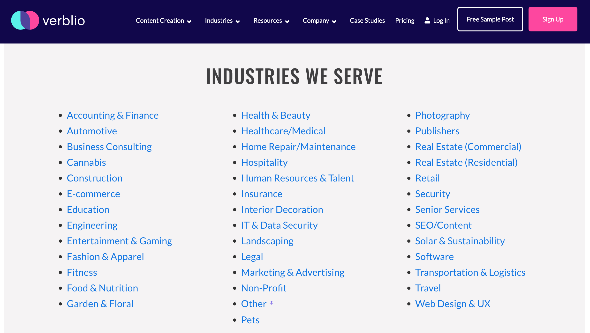
While in-house, I spearheaded a project to build out 38 industry-specific long-form landing pages as sales enablement, demand generation opportunities for Verblio. As a result, we grew organic traffic 500-1,000+% in 2018-2019 from prior time period through this crucial SEO website content project.
With this project, we sought to accomplish the following goals:
Establish a page suited to each of the industries Verblio writes for to answer the most commonly asked FAQ: “but how can you write for MY business / industry?”
Establish long-form, SEO-rich landing pages with forms to collect information and distribute the industry-specific samples we accumulated for each of the 38 industries as a follow-up tactic
Collect information as a source for marketing qualified leads that were extremely qualified, in regards to Verblio’s inbound customer funnel
Use this project as a forcing function to begin establishing the brand voice in newly established Verblio’s content
Use this project as a forcing function to increase our SEO footprint authentically and authoritatively across all industries, especially for the new domain of verblio.com
The Process
How I helped
Developed wireframes of long-form landing page template to be used at all steps of creation of one page
Collaborated to formalize the Verblio brand voice in newly established Verblio’s content with Verblio’s “voice”, our copywriter—concise, clear, punchy, engaging, spunky, and not at all pun-averse
Built and directed a team of niche-specific Verblio freelance writers to adhere to the brand voice guidelines, stress-testing, iterating, and adding to those guidelines as we progressed through the project
Provided industry-specific guidance/briefs to freelancers writing the pages to ensure FAQs I got frequently while I was in sales were addressed, among other directives
Coordinated cross-departmentally with brand copywriter, dozens of freelancers, in-house graphic designer, and key stakeholders in leadership to efficiently and effectively usher the project over the finish line
Maintain brand writing standards, adhere to SEO requirements and keywords, and abide by our design team’s visual brand guidelines
Executed visual design (with some interactive elements!) & content editing within Verblio’s WordPress instance (using Beaver Builder), problem solved when text didn’t fit the template or freelancers took liberties
Last review, line-editing, and punching up of existing copy, rewriting existing work as necessary
Hooked up backend of form submitting to our CRM, email marketing drip campaigns through Zapier to ensure follow-up to form submissions and fostering of warm leads
Effectively scaled processes to complete all 38 landing pages within allotted timeline, completing in batches
High-fidelity Prototype of legal landing page (Current State in 2023):
Read Queen Website Redesign
Project Overview
Project Summary & areas of opportunity
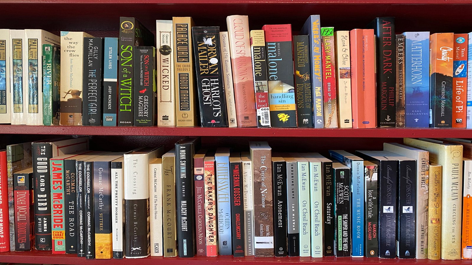
Read Queen, a bookstore outside of Boulder, CO has established itself as a powerful local presence in the few short years it’s been in operation. However, they’ve limited their customers’ lifetime value by not having an ecommerce function on their website. Further, their impeccable, delightful in-person shopping experience notably does not translate to digital.
Project Duration: 2.5 weeks, on-spec project, November-December 2022
Team: 1, Kali Bizzul
Tools: Figma, Optimal Workshop, Google Workspace
Methods: Secondary Research, Contextual Inquiries, Card Sorting, User Interviews, Competitive & Comparative Analysis, Heuristic Analysis, Affinity Mapping, Persona Development, User Flows, User Journey Mapping, Site Map, Sketching, Wireframing, Usability Testing, Prototyping, Developing Components, Style Guide
Goals
Goal for users: To enable customers to buy books online directly through Read Queen’s website
Read Queen business goal: To gain and retain customers while competing on a local level with corporate behemoths like Amazon
Hypothesis
If we build an ecommerce feature directly into the Read Queen’s website for the redesign, it will enable them to increase lifetime value (LTV) of each customer, as well as translate their delightful in-person experience from in-person to digital.
Preview of Prototype
The Process
1. Discover: what do the bookstore landscape & buying behaviors look like?
How does Read Queen stack up against its local competition?
To get to the heart of this question, I had these research goals from the outset:
Identify issues users have with navigating and completing simple tasks on Read Queen’s current website
Explore what features or experiences a customer would want/need buying books or other items online
Competitive & Comparative Analysis
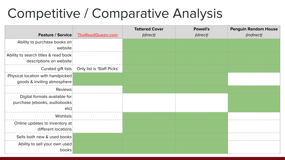
The competitive & comparative analysis highlighted that the current Read Queen website drastically underserves a competitive market, has little functionality including inability to browse books or buy online, and thus, prevents customers from making buying decisions. This is especially concerning given that Read Queen has only been in business for 2-3 years.
This means that Read Queen’s desktop website as it stands is a barrier for current and potential new customers to a) make buying decisions through the help of product descriptions / reviews, and most importantly b) make purchases. The desktop site should be redesigned to hit these pain points.
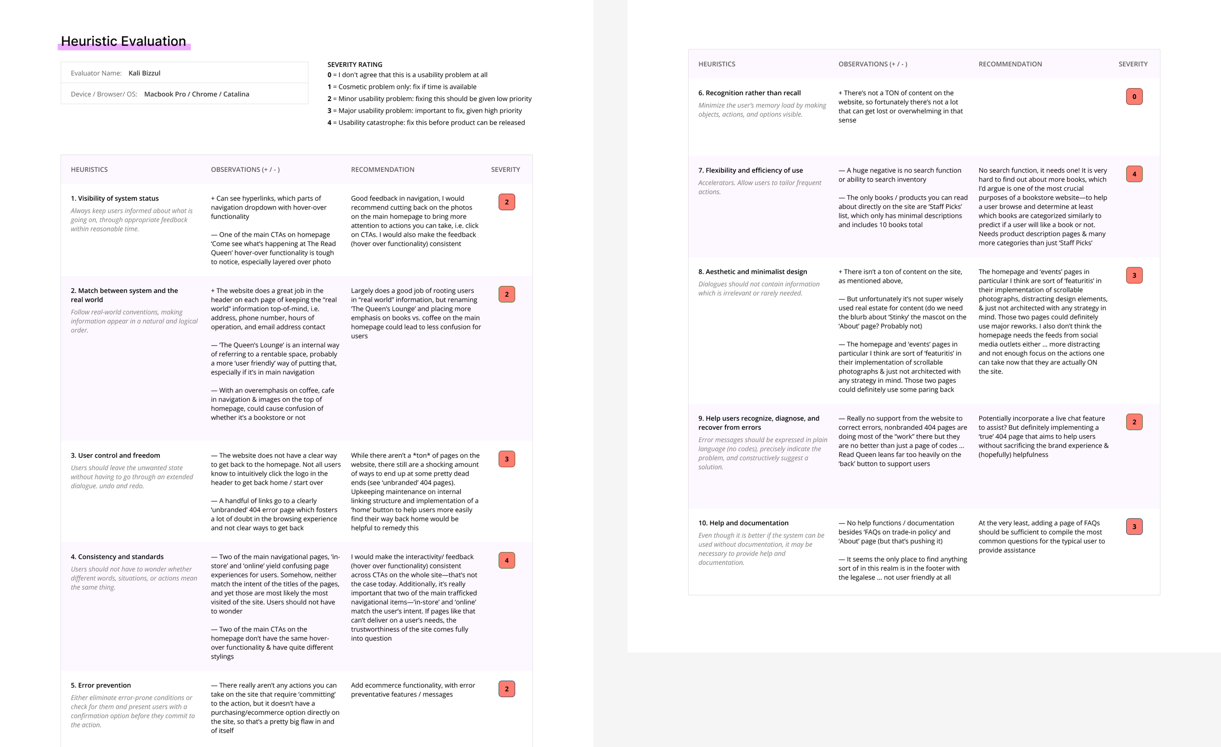
Heuristic Evaluation
Contextual Inquiries, User Interviews, affinity mapping
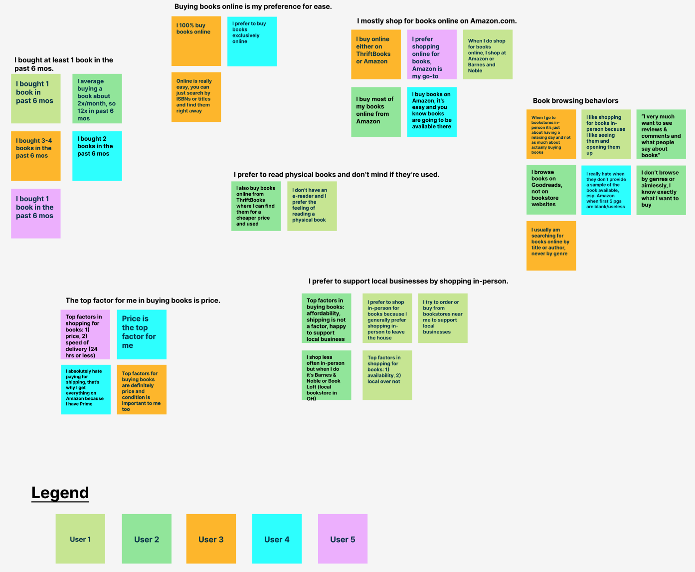
The user interviews highlighted that users are savvy with buying books online from Amazon and other highly competitive entities and prefer to purchase online. Not surprisingly, cost emerges as the top factor determining online book purchases for users.
This means that Read Queen needs to provide an ecommerce experience on their website to meet the needs of their customers to stay competitive in the space.
Key research Takeaways
Through usability testing, users couldn’t accomplish basic tasks, like browse books by genre, read book descriptions, or buy anything. It proved frustrating for the majority of users.
Most users interviewed wanted to actively support a local business over big corporate entities.
Users typically buy books online for ease & cost, especially after COVID-19.
Price wins out as top factor for users when buying books.
Bookstores need to support online browsing behaviors as it’s now a huge part of the customer journey in the space. Any that don’t will lag in supporting prior and potential customers.
2. Define: who is the Read Queen customer & what do they need?
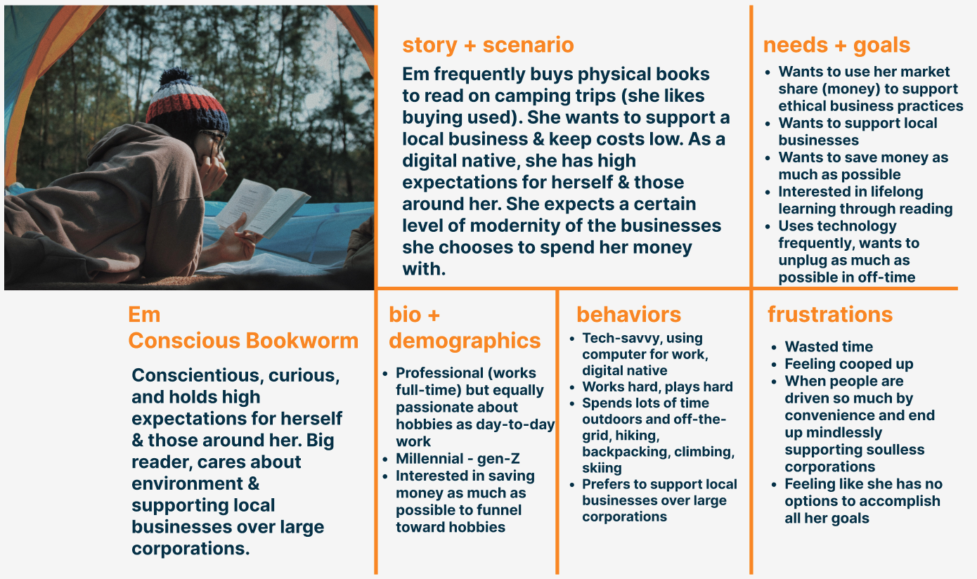
Based on my research, I developed one primary user persona. Meet Em, the conscious, tech-savvy bookworm.
Primary Persona
Problem Statement
User prefers to buy books online AND support a local business, but they are unable to buy or browse books online through their neighborhood bookstore’s website (The Read Queen).
How Might We:
Capture more market share of book buyers for Read Queen beyond the in-person shopping experience?
Create an online shopping experience to actually allow users to buy books directly from Read Queen?
Allow users that browse books online to do so through their neighborhood bookstore, Read Queen?
Encourage users to buy more than just 1 book that they came to the website to buy?
Present an ecommerce experience to the user to make it easier to support local bookstores?
Stay competitive with prices (or how we present them) to allow users to feel they’re getting the best deal on books?
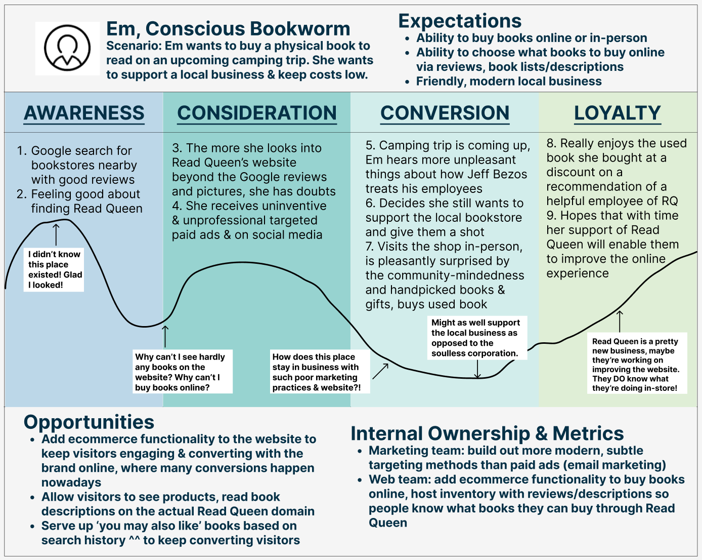
User journey map (retrospective)
3. Design: how did we make research findings actionable to inform a solution?
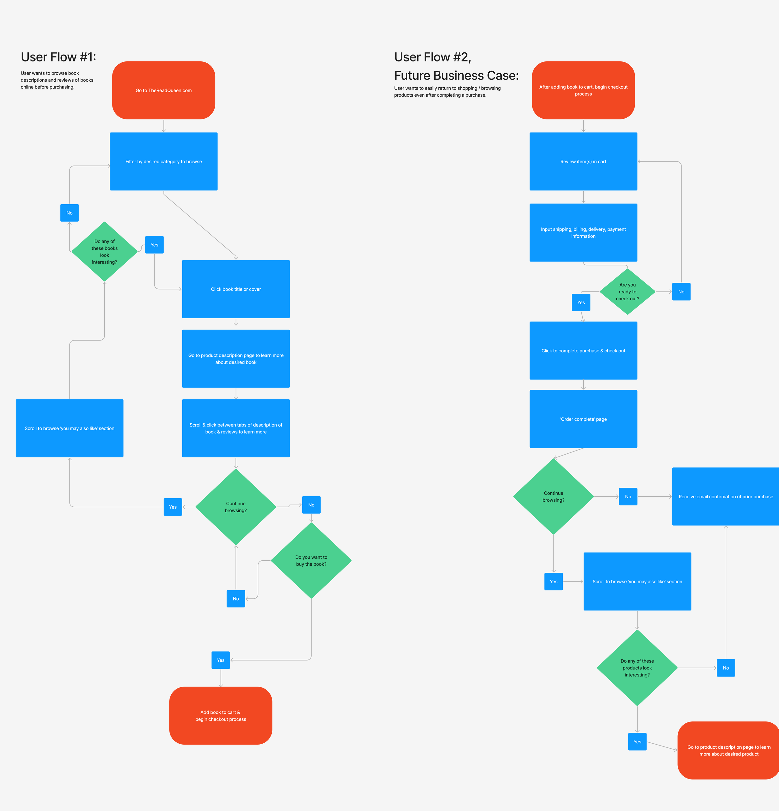
Userflows
Once I determined the persona and identified Em’s needs, I sought out design solutions for them.
The left shows Em’s future userflow to browse book descriptions / reviews to then eventually purchase a book online.
The right shows Em’s userflow to benefit Read Queen’s business, enabling someone who just bought a book on the website to easily return back to browsing.
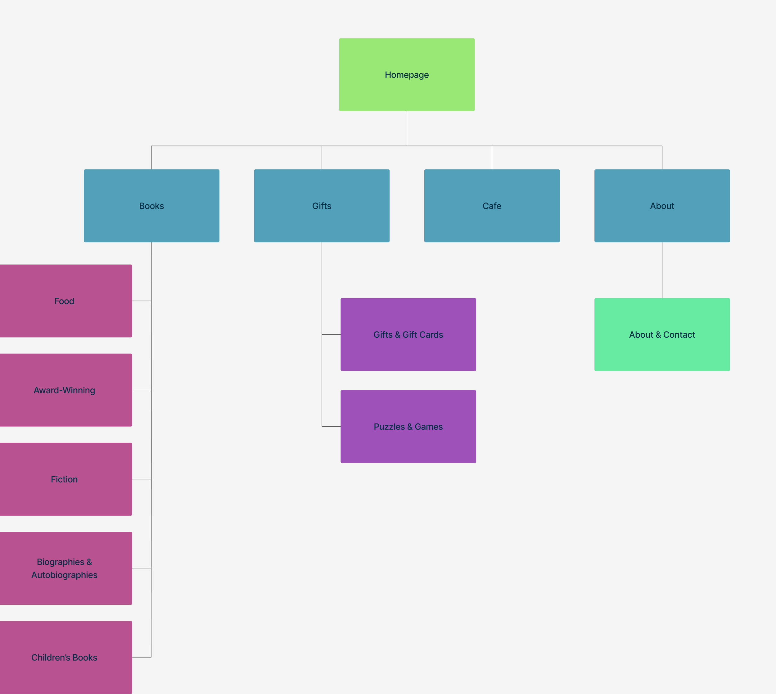
Sitemap
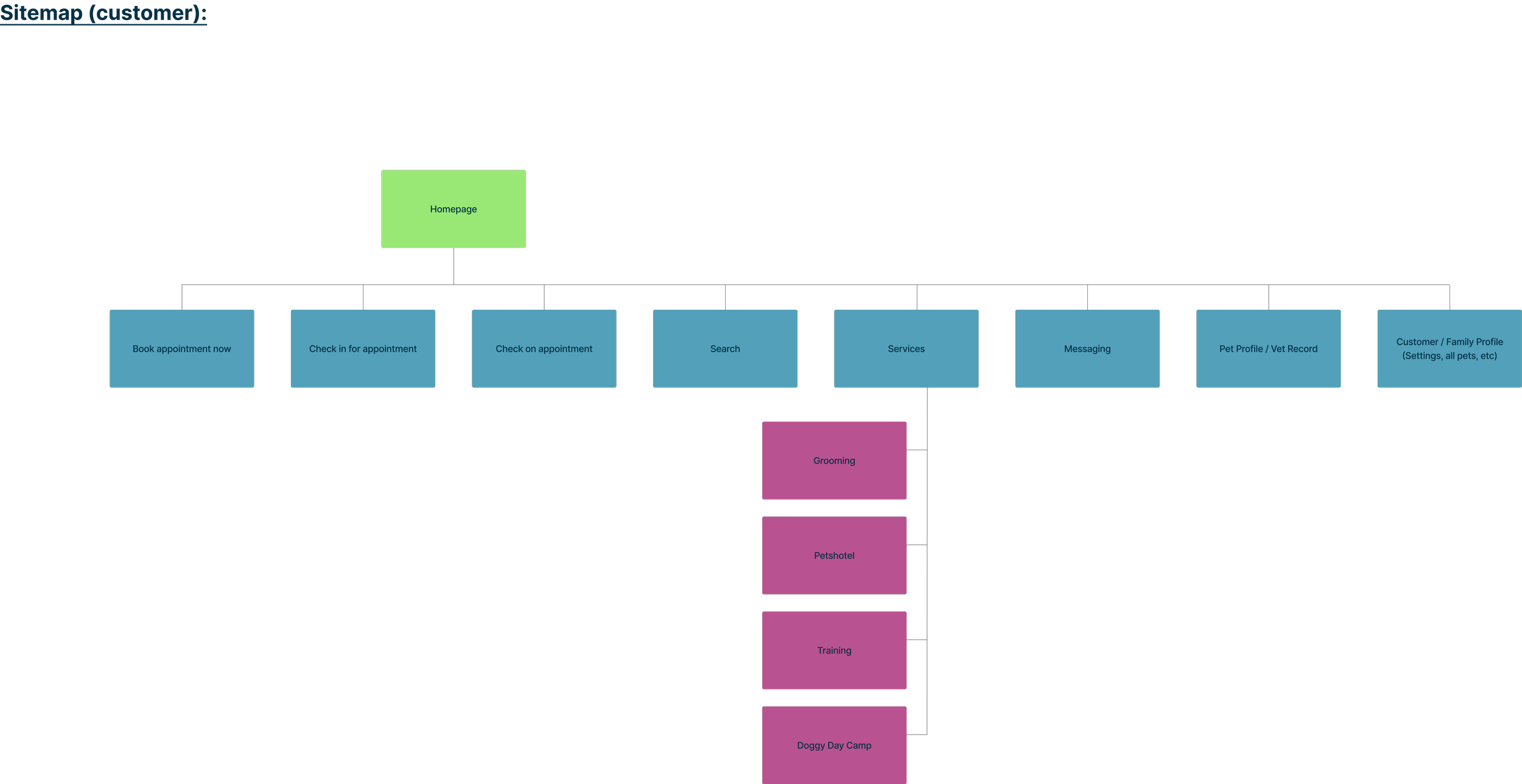
After completing an open card sort of Read Queen’s inventory with a few users through Optimal Workshop, I reorganized the Read Queen’s information architecture and sitemap. This sitemap allows for an efficient way for Em to accomplish their goals as shown in the above userflows.
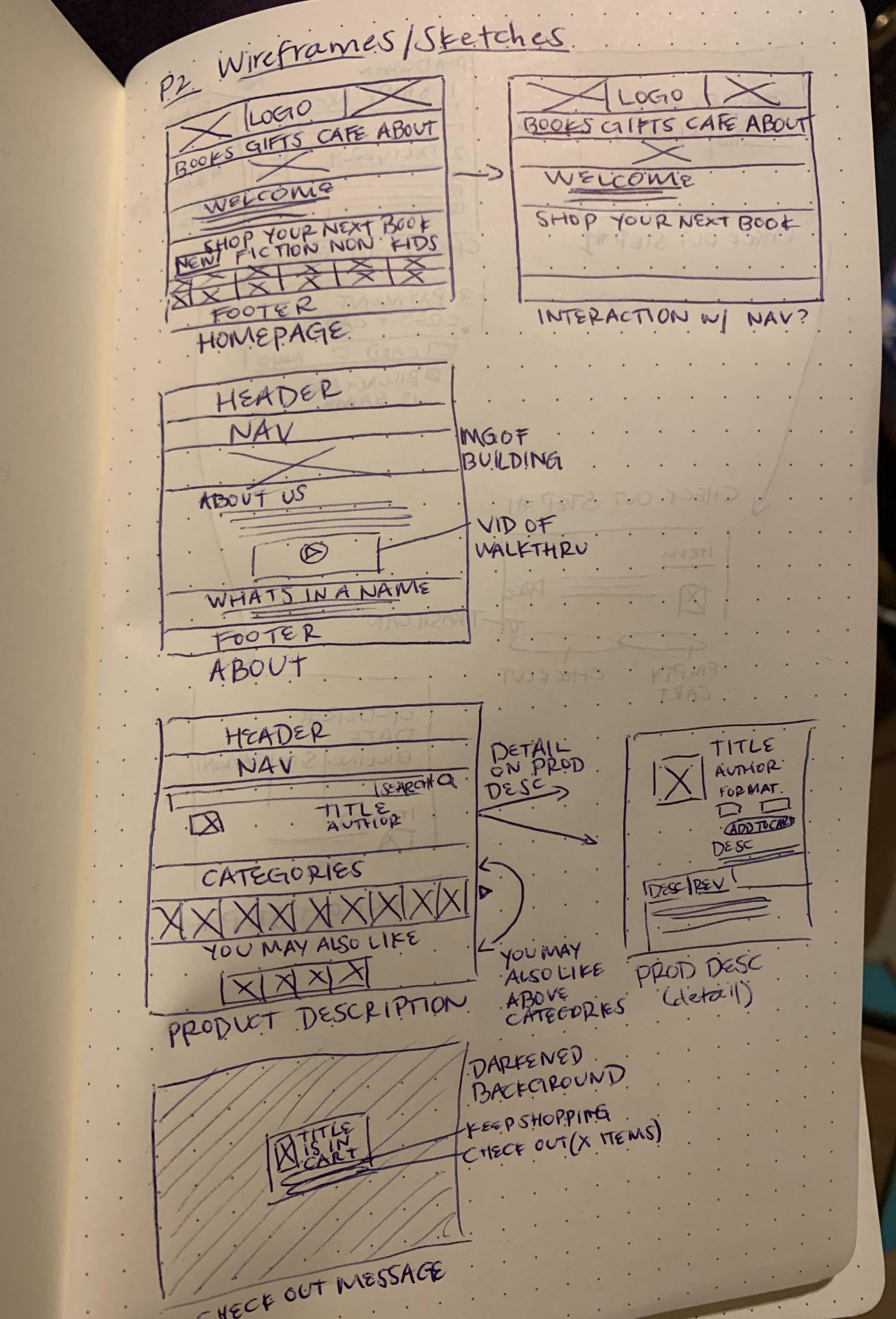
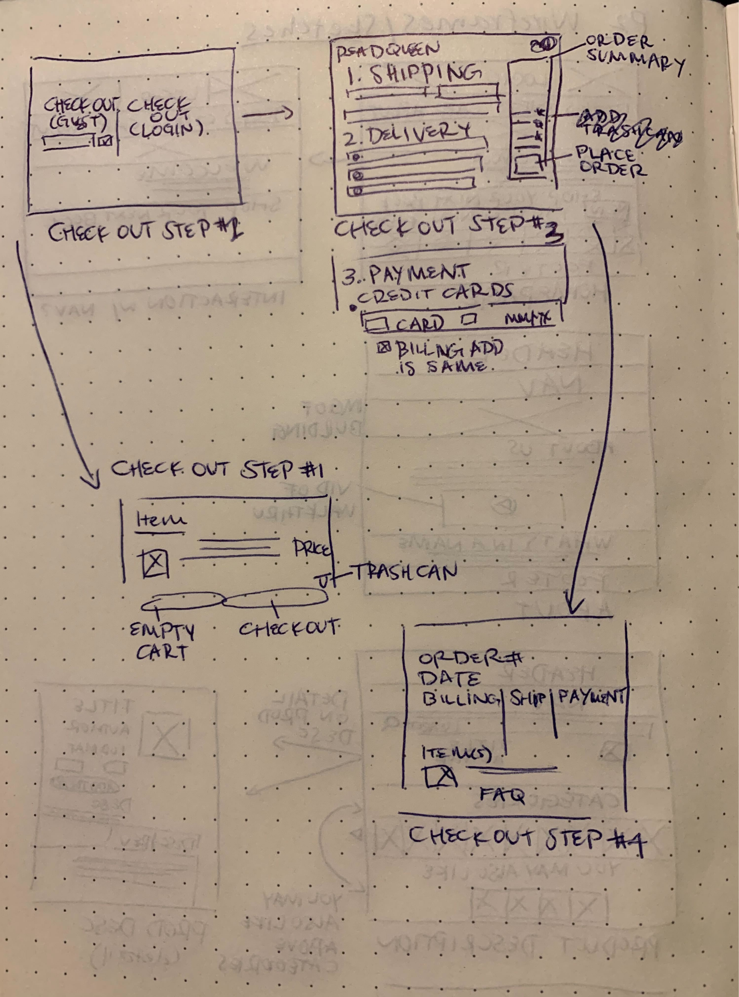
Sketches
Mid-Fidelity Prototype
High-fidelity Prototype iterations (post Usability testing round #2)
The high fidelity version of the mid-fidelity wireframes are shown here.
The goal was threefold: 1) allow Em to sort by genre, 2) learn more about Read Queen as a business, and 3) build out a checkout process to allow Em to purchase a children’s book as a gift.
4. Deliver: did our solution work?
Results & Design Iterations
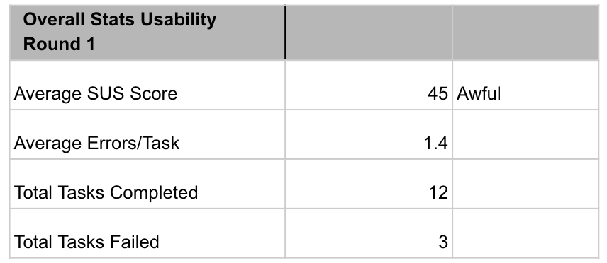
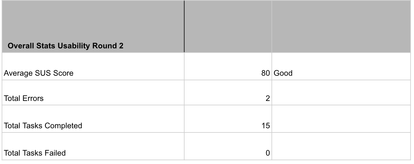
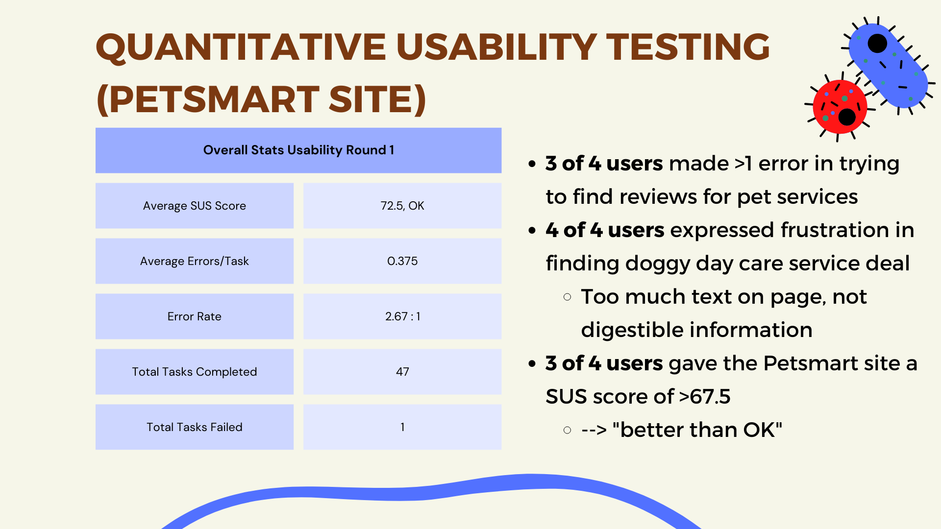
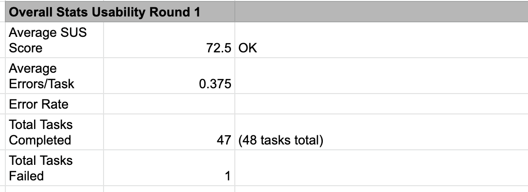
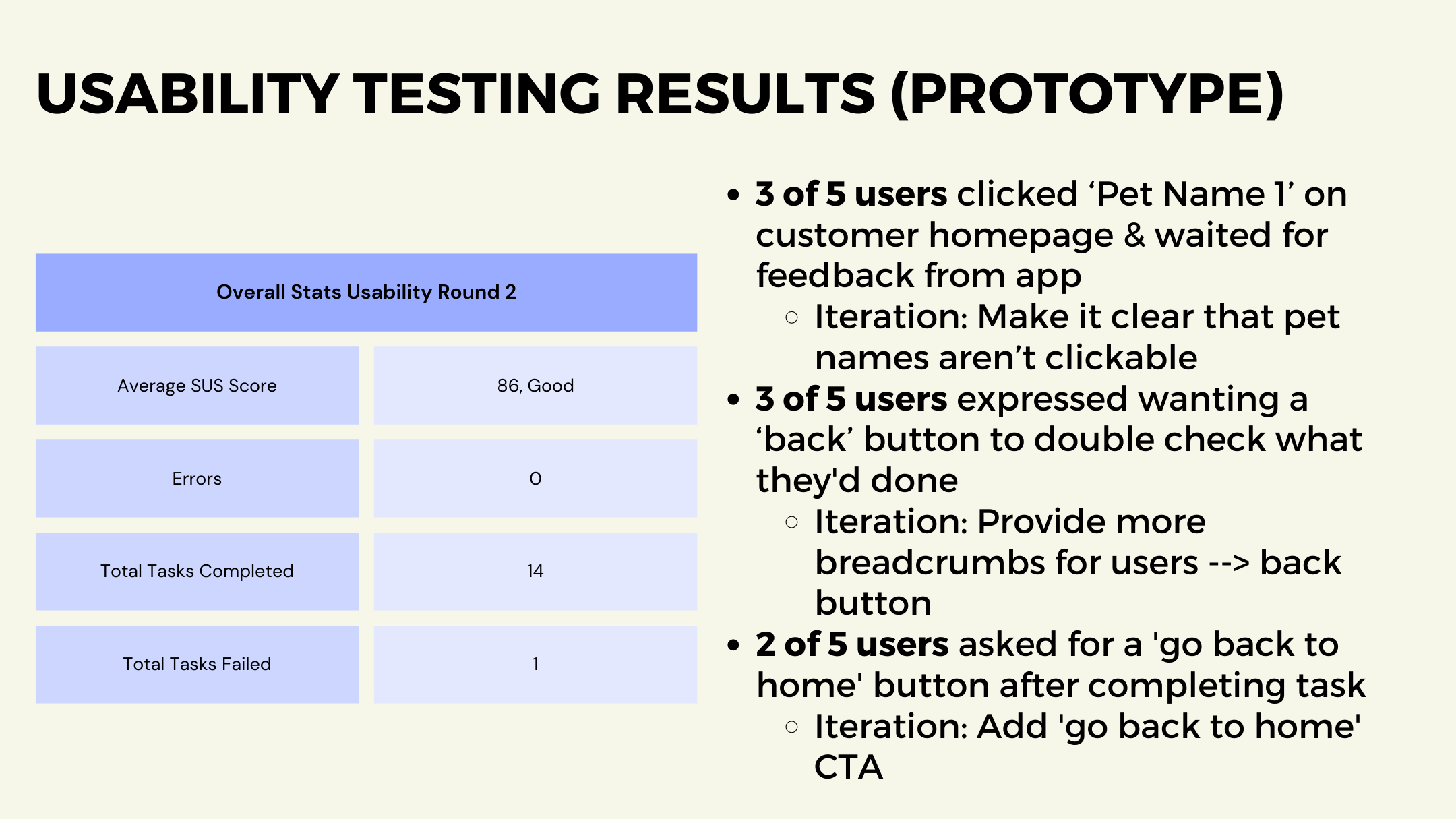
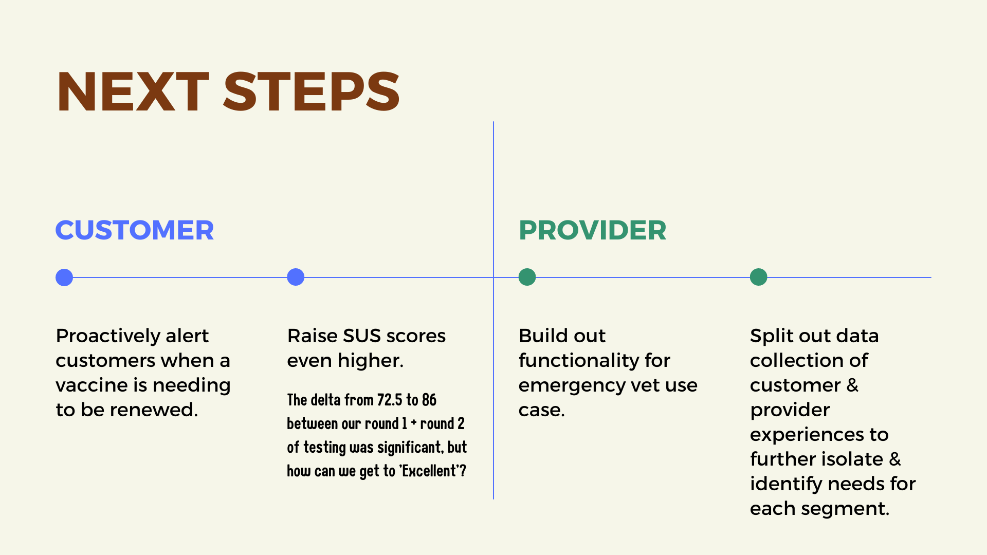
Between rounds of mid-fidelity and high-fidelity prototypes, I conducted a second round of usability testing. In the end, I was able to design a solution to nearly double the SUS score from before the redesign, as well as eliminate any tasks failed.
ReadQueen.com Usability Results Before + After Redesign
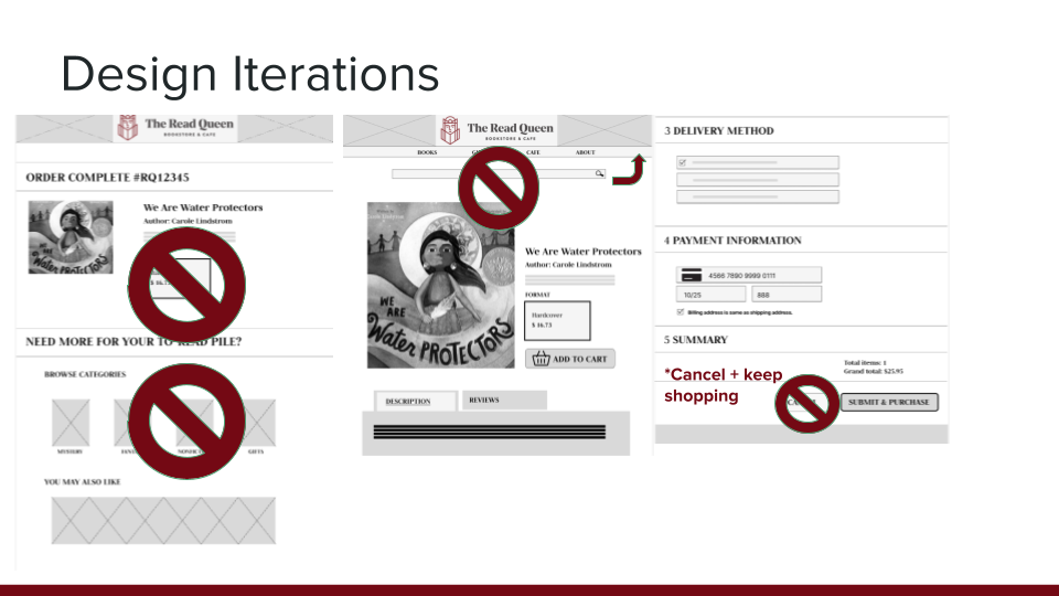
Through this process, I identified and implemented the following design iterations as expressed by users:
Online consumers expect a more minimal ‘order complete’ page so I pared it back
After customers completed a purchase, they wanted to continue browsing by ‘you may like’ versus browsing by category, so I removed that section
The search bar is more useful in main navigation vs. nestled on product page
The button to ‘cancel’ was ambiguous for users in the checkout process, ‘cancel + keep shopping’ was suggested
Learnings & next steps
Users really appreciated being able to continue shopping even after making purchase, which is a pain point on other websites — plus, a value-add for the business!
Is a ‘home’ button with an icon necessary versus just clicking the business’s logo? Split between those tested
Should we build a more ‘dynamic’ representation of cart, including notification-like functionality that updates each time the user adds to the cart?
Petsmart Services Mobile App
PROJECT SUMMARY & AREAS OF OPPORTUNITY
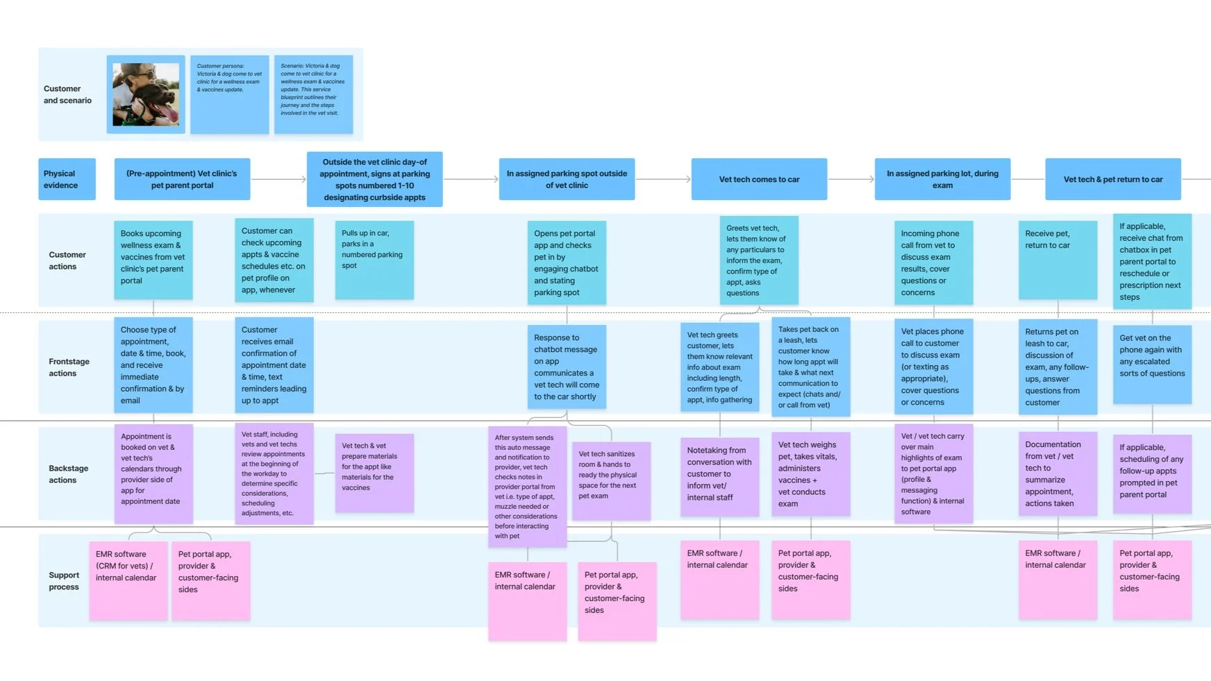
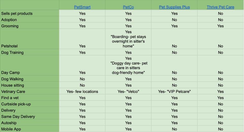
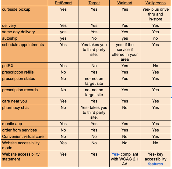
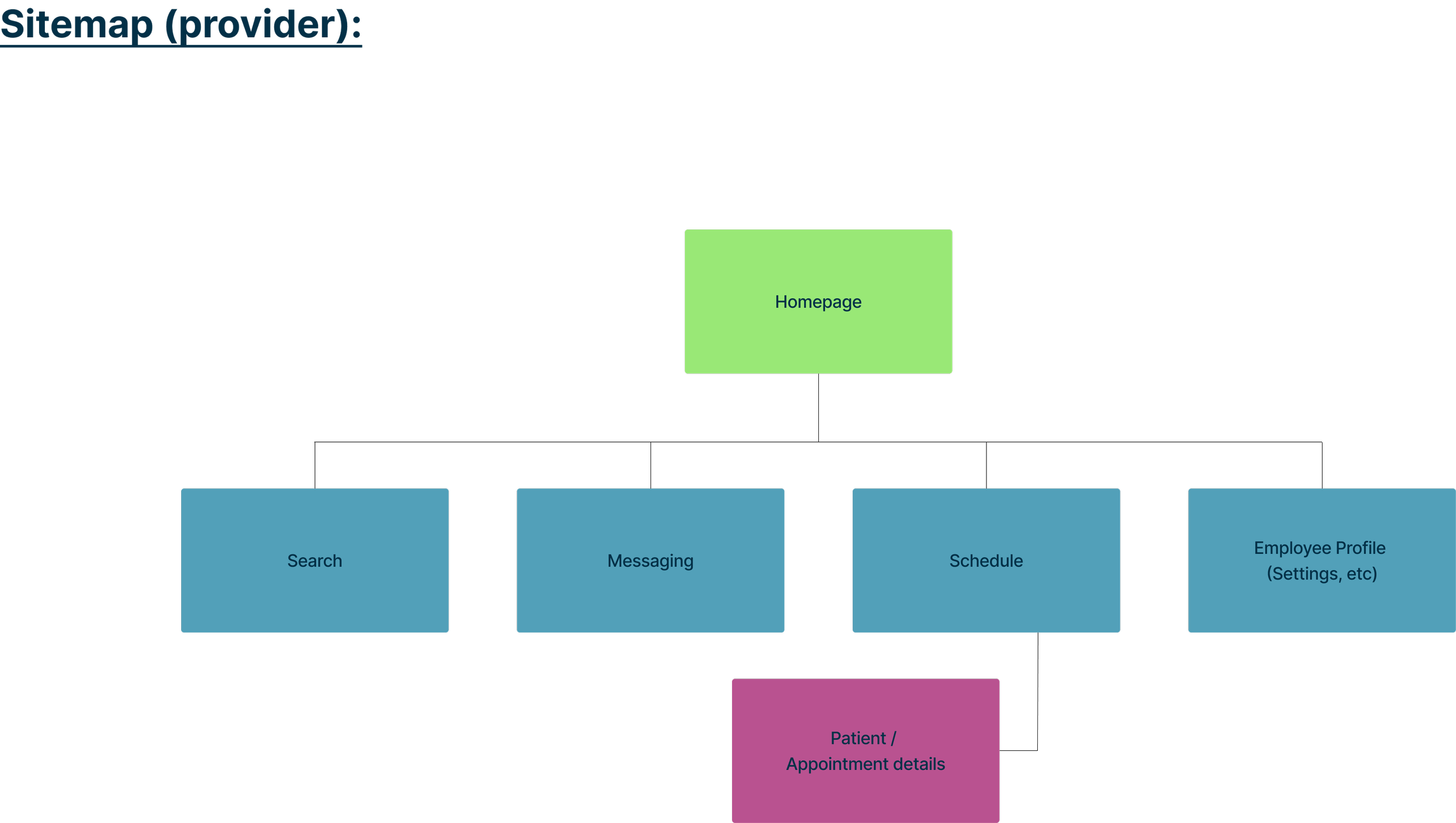
Petsmart needed to build a new mobile app experience to efficiently connect customers and providers given COVID-19 constraints during services appointments, like veterinary care. This project delivers to two main personas: pet parents + veterinary providers.
Project Duration: 3-week sprint, on-spec project, December 2022-January 2023
Team: Kali Bizzul, Bailey Alexander, Abby Laing, Sarai Aguayo
Tools: Figma, Trello, Canva, Google Workspace, Zoom, Slack
Methods: Secondary Research, Contextual Inquiries, User Interviews, Competitive & Comparative Analysis, Heuristic Analysis, Accessibility Analysis, Affinity Mapping, Persona Development, User Flows, User Journey Mapping, Site Map, Service Design Blueprint, Storyboarding, Sketching, Wireframing, Usability Testing, Prototyping, Developing Components, Style Guide
Goals
Goal for user:
Petsmart business goal for providers:
Preview of Mobile Prototypes
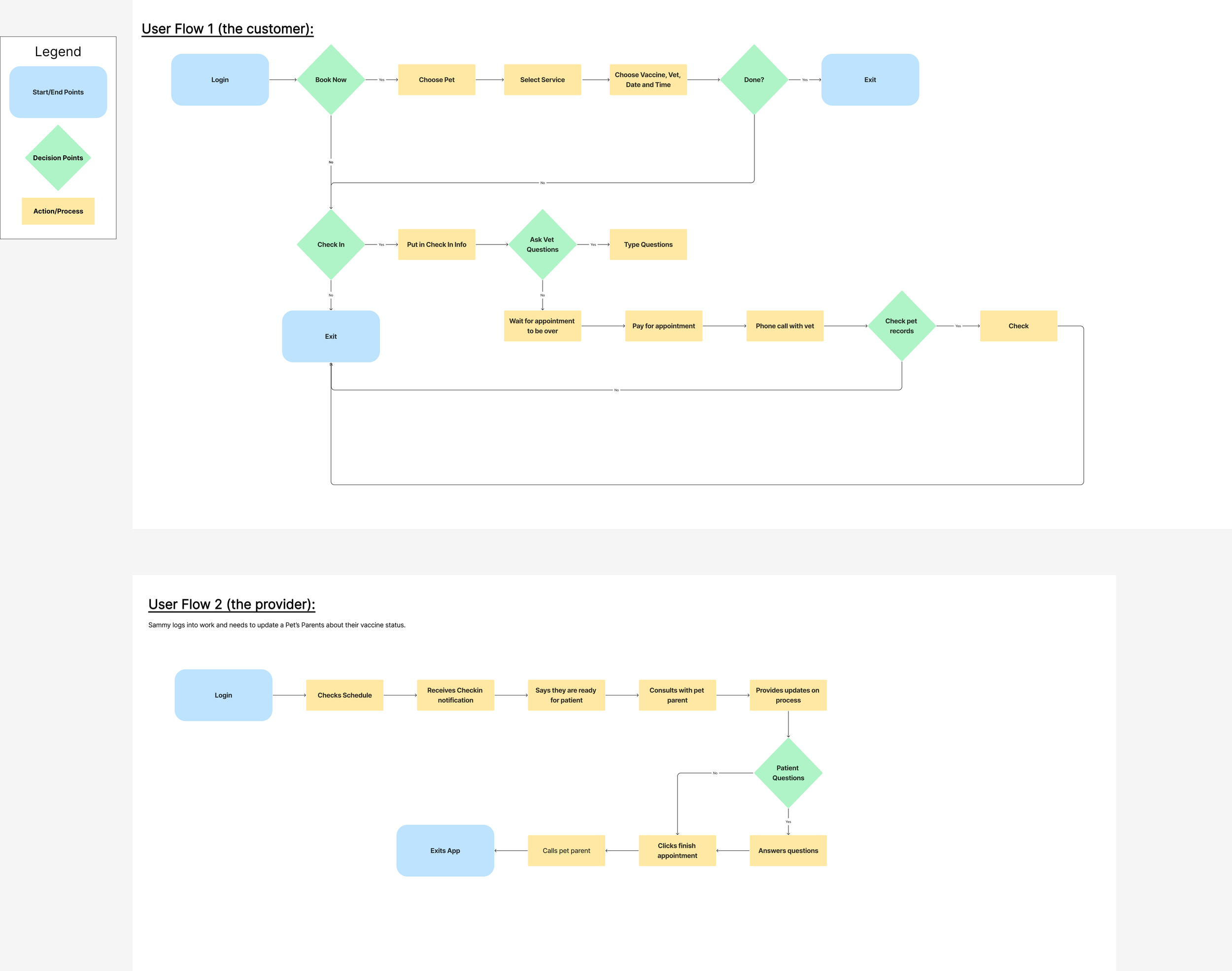
Flow 1: The internal flow for the provider, the vet tech
Flow 2: The flow for the user, the pet parent
The Process
My Role
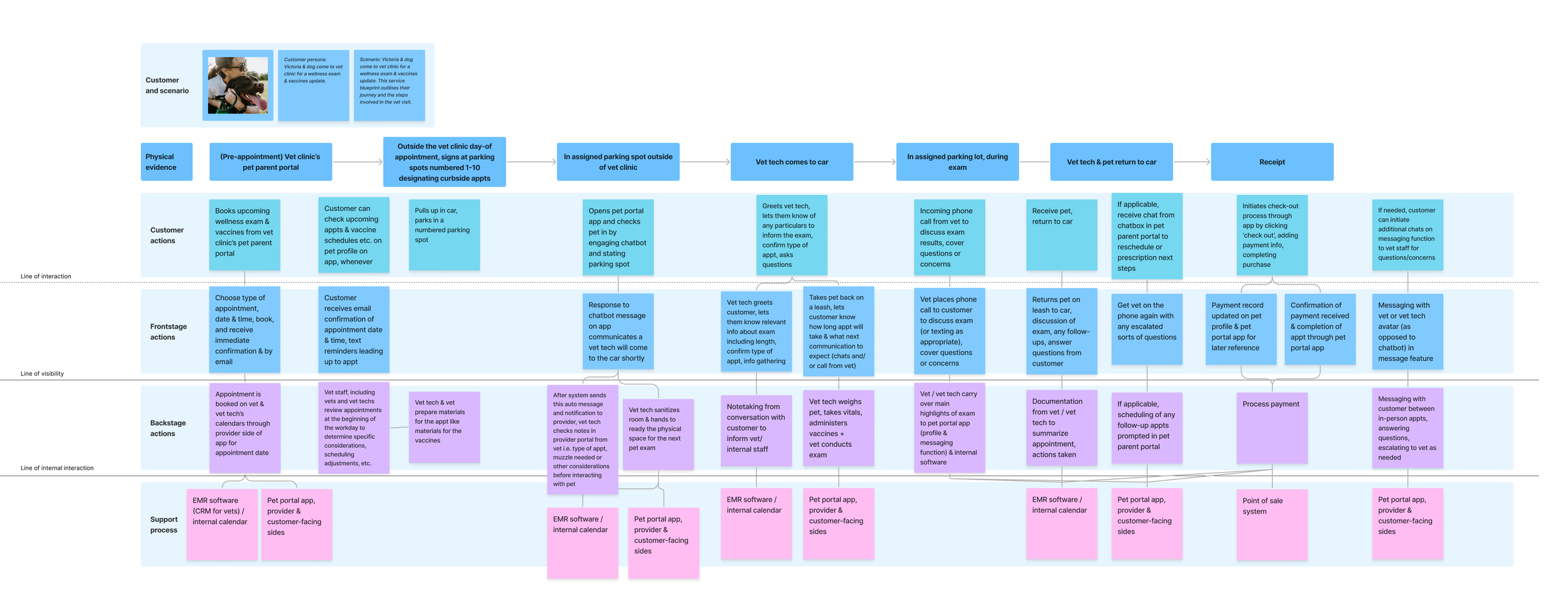
My three group members and I worked together for all phases of the project as a team but took primary responsibility for one phase or set of deliverables for the group. I took the lead in creating our project management plan in Trello, usability testing and reporting for both round 1 & 2, the service design blueprint, information architecture and sitemaps, and the final content strategy. Collaboration and communication come naturally to me; I thrive in the curiosity that comes with the research phase, quantifying and identifying actionable steps, and making those next steps concrete with my project manager brain.
1. Discover: what does the Petsmart services experience look like today?
Key Research takeaways
Competitive & comparative analysis
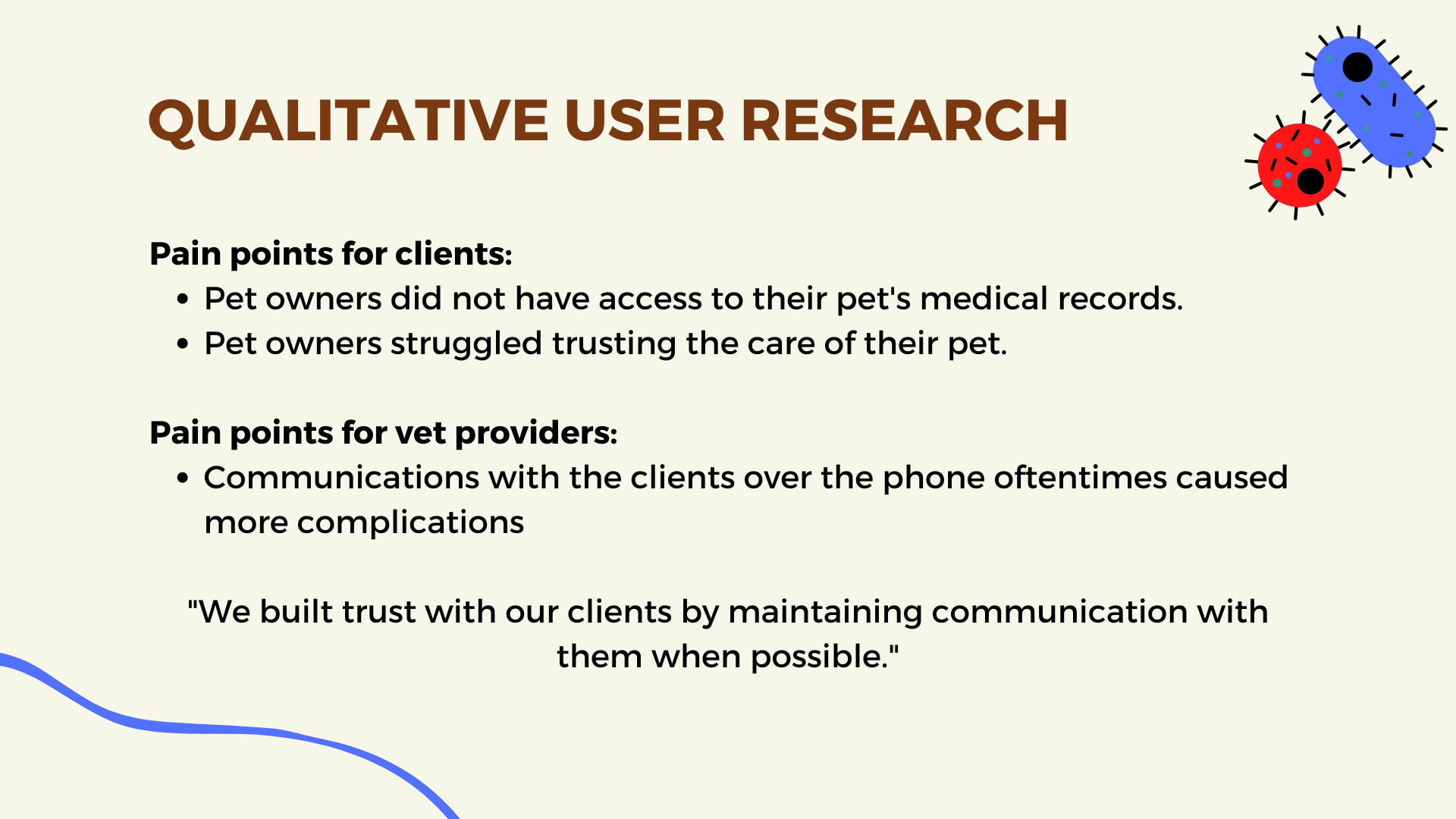
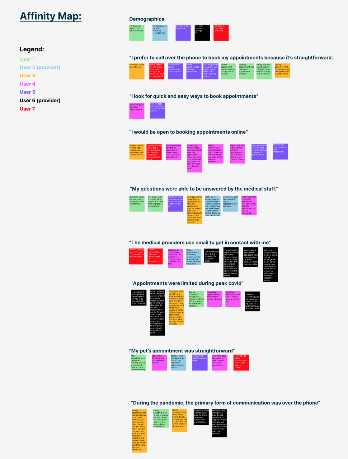
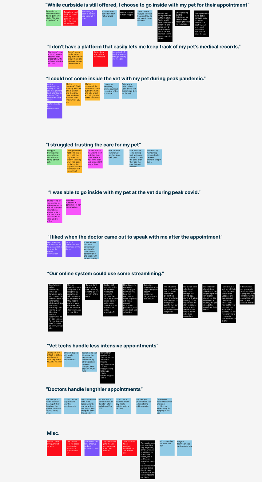
Contextual Inquiries, User Interviews, affinity mapping
2. Define:
a) Petsmart’s customer & what they need
b) Petsmart’s provider & what they need
Primary & Secondary PERSONAS
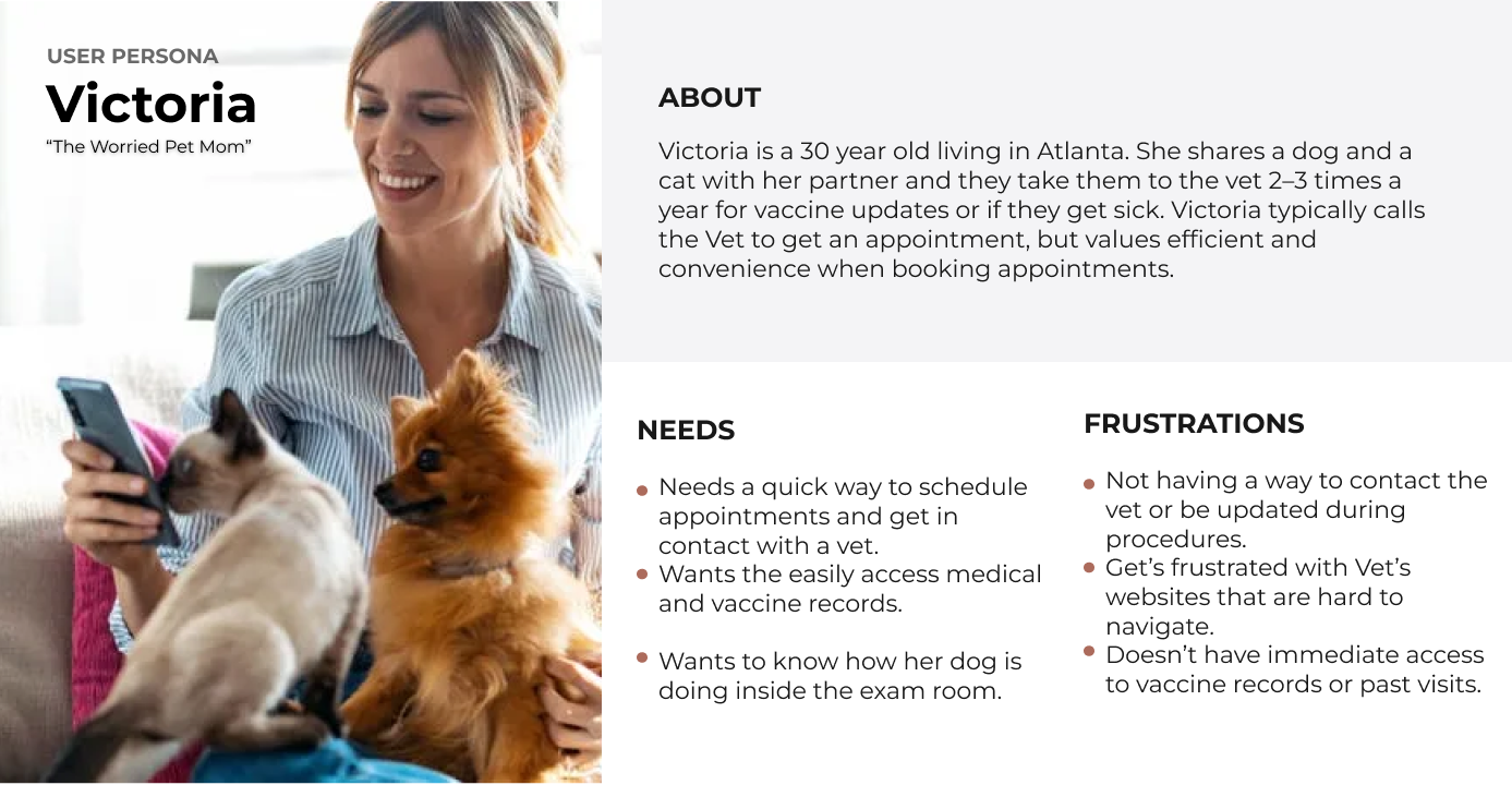
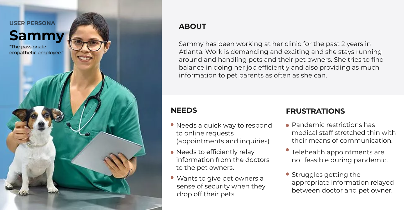
Based on our research, we developed two user personas. The first was caring, worried pet parent Victoria. The second, the passionate, professional vet tech named Sammy.
Victoria’s Problem Statement
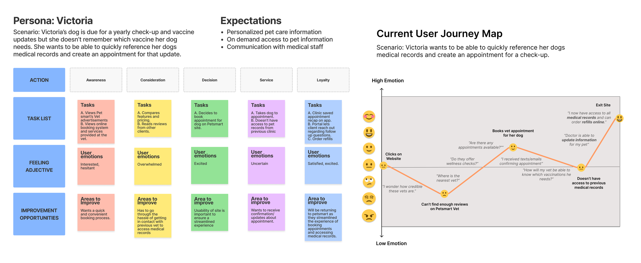
Victoria needs an efficient way to schedule appointments and get in contact with the vet without the stress of keeping track of her pets’ records and hassle of trying to get information from the vet over a phone call due to COVID-19 restrictions.
Sammy’s Problem Statement
Sammy needs an efficient way to keep track of her patients and keep pet parents updated during the patients’ appointments while dealing with a lack of in-person communication due to COVID-19 restrictions.
Combined Problem Statement
Victoria and Sammy need an efficient way to connect with less face-to-face interactions due to COVID-19 restrictions.
How might we:
Create an experience that will help Sammy and Victoria connect efficiently?
Help put users at ease when going to access pet information and records?
Make the appointment scheduling process quick and feasible?
Help Victoria feel safe and comfortable with the information she is receiving from the vet?
Help Victoria feel involved during her pet’s appointment without her physically being in the room?
Make the pet record updating process quick and seamless?
